
Logo
The wordmark reads “Croprix”, with the leaf symbol in place of the o. Use the supplied files exactly as they are; never redraw, retrace or recolour them. The symbol may stand on its own, but the wordmark never appears without it. Where no graphics can be used, such as legal text, write the name in plain text. Keep it in Latin letters in every language: never translate or transliterate it.
Put the primary logo on white, Sand-50, Navy-50 or Leaf-50 only. The reverse logo goes on Navy-900 or Navy-950, or on a dark photo where the leaf keeps at least 3:1 contrast. Anywhere else on a colour photo, use the mono white logo over a dark area and the mono Navy logo over a light one.
 Primary on white
croprix-logo.svg- Primary on Sand-50
croprix-logo.svg - Primary on Navy-50
croprix-logo.svg - Primary on Leaf-50
croprix-logo.svg - Reverse on Navy-900
croprix-logo-reverse.svg - Reverse on Navy-950
croprix-logo-reverse.svg
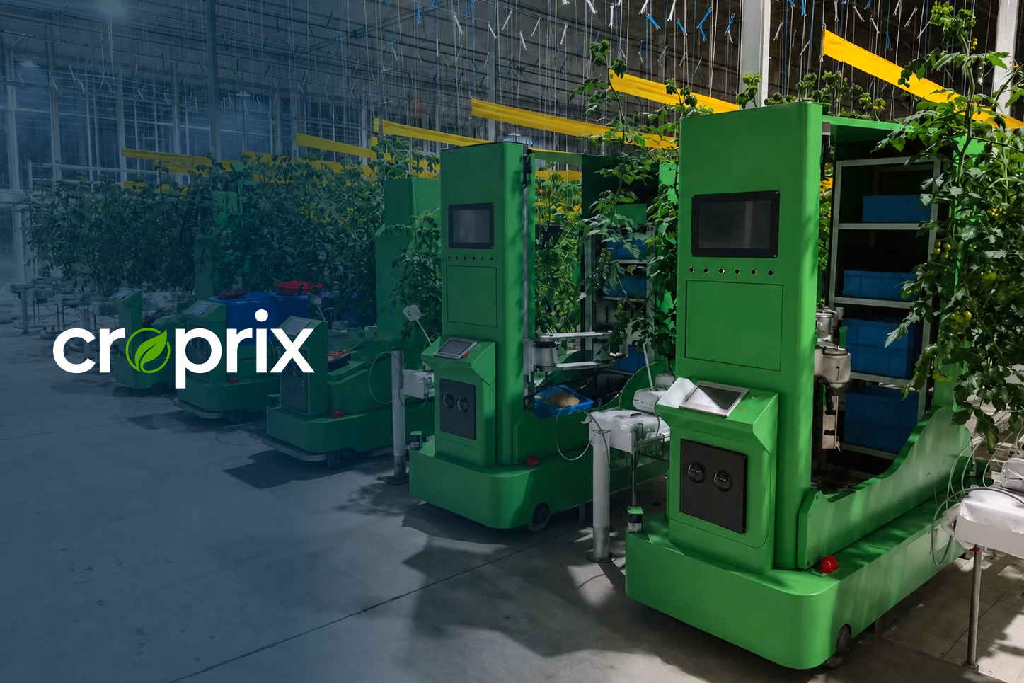
croprix-logo-reverse.svgReverse on dark foliage, inside a Navy-950 gradient: the leaf reaches 4.1:1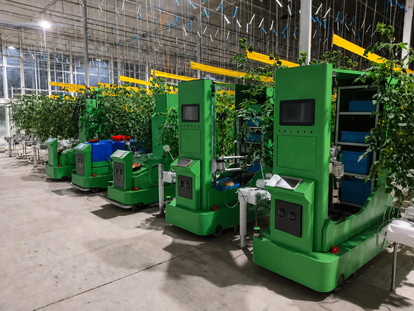

croprix-logo-mono-navy.svgMono Navy on a flat, light floor, clear of the machines and railsClear space
Keep 0.5 L clear on every side, where L is the height of the leaf; the symbol on its own needs 0.25 L. The supplied files already include this margin, so place them by their edges and do not crop.
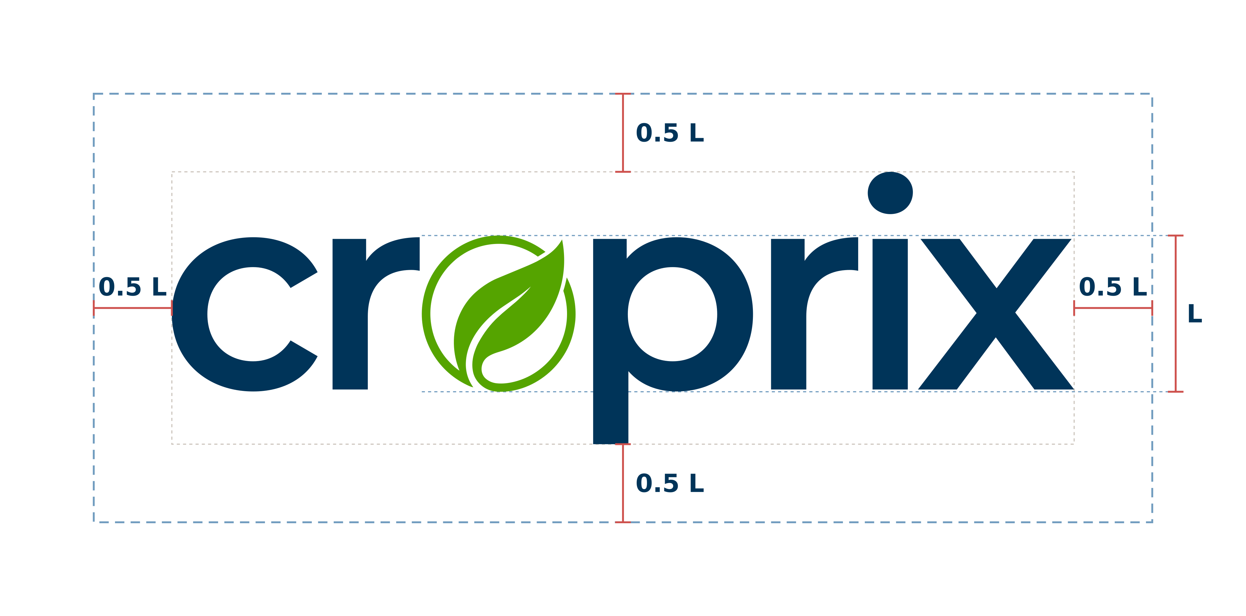
croprix-logo-clearspace.svgMinimum size
- Primary
- 96 px wide · 24 mm in print
- Stacked
- 64 px high · 16 mm in print
- Symbol
- 16 px · 4 mm in print
Measured on the file’s edges, clear space included.

Never
 Stretch or squash it
 Recolour it; use only the supplied variants
 Add shadows, outlines or other effects
 Rotate it
 Place it on low-contrast or busy backgrounds
 Change the letter spacing or rearrange the letters
Files
- PrimaryNavy wordmark, Leaf symbolSVG
- ReverseWhite wordmark, Leaf symbolSVG
- MonoOne colour throughout, leaf includedNavyWhiteBlack
- StackedSymbol above the wordmarkSVG
- SymbolThe leaf on its ownSVG
SVG is the master file. PNG exports from 512 to 2048 px wide are on the Downloads page (in Chinese).
Co-branding
Separate the two logos with a vertical rule 1 L high, with 1 L of space on each side. The Croprix logo is never smaller than the partner’s. Partners using our logo send the layout to hi@croprix.com before first release; see the partner logo terms (in Chinese).
Partner logo
Two brand colours
NavyNavy-900
- HEX
- #003459
- RGB
- 0 52 89
- CMYK
- 100 42 0 65
- Pantone
- 302 C
LeafLeaf-600
- HEX
- #55A400
- RGB
- 85 164 0
- CMYK
- 48 0 100 36
- Pantone
- 369 C
Page backgrounds are Sand-50 or white. As a rule of thumb, a layout is 60% Sand-50 or white, 20% Navy and 10% Leaf; everything else shares the last 10%.
60%
20%
10%
The last 10% is shared by Harvest, Sky, Soil and Crimson.
- Leaf marks only what is alive, active or in progress: primary buttons, success, crops, the current state. Never use it as a large fill.
- Text on Leaf is Navy-950. White text on Leaf only at 18.66 px bold or larger.
- The other five colour families support these two: Sand for neutrals; Sky, Harvest and Soil for information, warnings and charts; Crimson for errors only. Each family runs in 11 steps, from 50 to 950.
- Pantone values are the closest matches; always proof before printing.
Typography
MontserratHeadings 600 / 700
Body 400 / 500
- Latin, Cyrillic
- Montserrat, also for Vietnamese
- Simplified Chinese
- Noto Sans SC
- Traditional Chinese
- Noto Sans TC
- Japanese
- Noto Sans JP
- Korean
- Noto Sans KR
- Arabic, Persian
- Noto Sans Arabic
- Hindi
- Noto Sans Devanagari
- Thai
- Noto Sans Thai
- Figures
- Montserrat tabular figures, in every language, including tables and data panels
- Code, serial numbers, logs
- JetBrains Mono
- Type scale
- 16 px base, ratio 1.25
- Tracking
- Latin: headings −0.01 em, all-caps labels +0.08 em
Cyrillic: headings 0, all-caps labels +0.06 em
Vietnamese: headings 0, all-caps labels +0.04 em
Chinese, Japanese, Korean: 0
Body text: 0 in every script
All fonts are free under the SIL Open Font License. Chinese, Japanese and Korean headings use 500 or 600, never all caps or italics.
Graphics & icons
- Rows, horizontal
rows-h.svg - Rows, vertical
rows-v.svg - Rows on Navy-900
rows-h-navy.svg - Topo, background texture only
topo.svg
There are two supporting graphics, and only two. Rows are parallel 1 px lines 24 px apart, horizontal or vertical but never diagonal; they stand for the 1.6 m spacing between greenhouse crop rows. Topo contour lines serve only as a background texture, at 8% opacity or less. Never draw decorative lines out of the logo.
Icons sit on a 24 px grid with a 1.75 px stroke, round caps and joins, outline only, in one colour. Use the supplied set of 48 and ask us before adding new ones.
Imagery
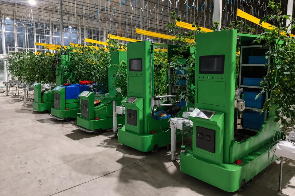 Grade target: true greens, warm shadowsFor colour only; shoot to the rules below
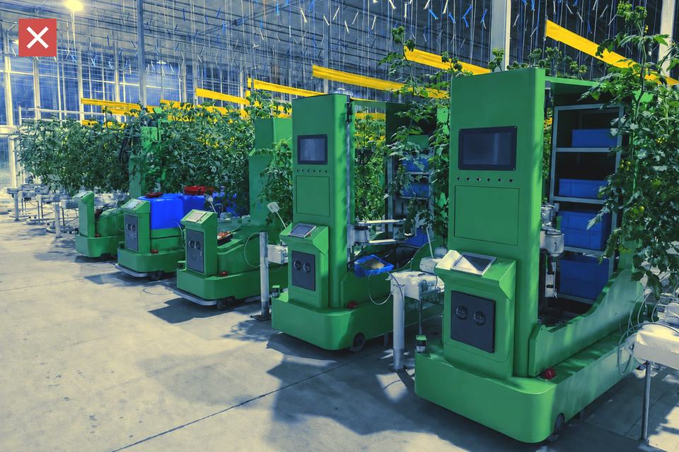 Teal filter
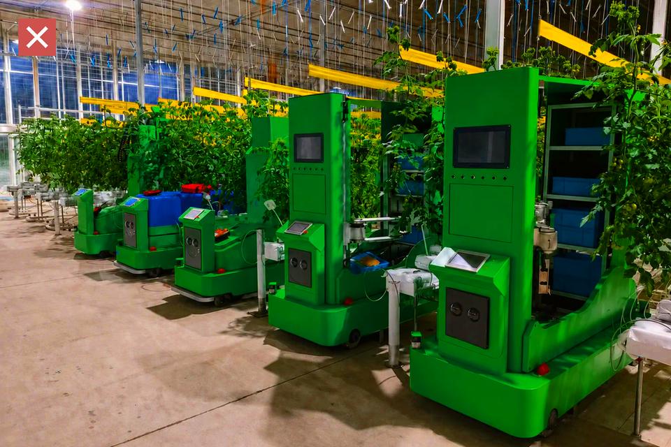 Oversaturated
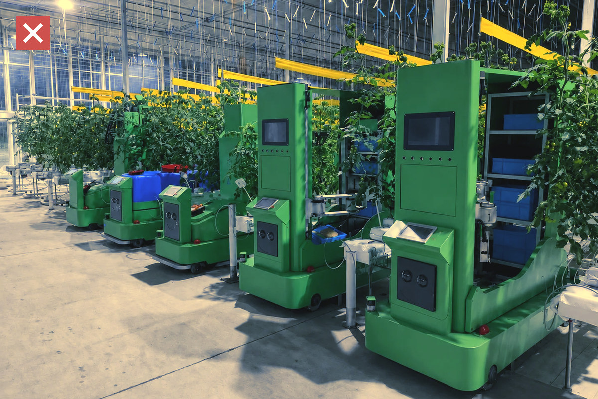
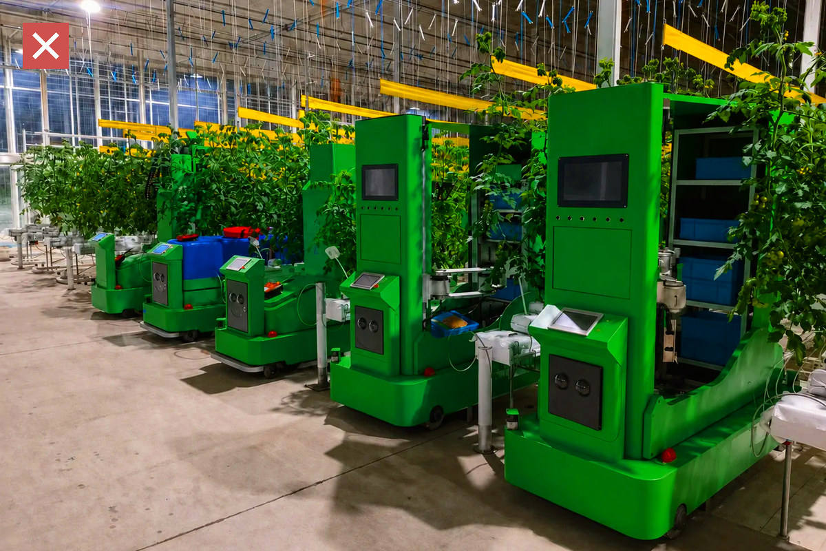


- Real greenhouses in natural overhead light, looking down the crop rows.
- Robots at work between the rows, with crops or people for scale. People are working, not posing or looking at the camera.
- No staged shots, drone panoramas, CG renders, stock or AI-generated images.
- Keep greens true and shadows warm: grade with the croprix-field Lightroom preset, and never add teal or duotone filters, vignettes or heavy HDR.
- Crop to 3:2 or 16:9 landscape, or 4:5 portrait.
- Logo on photos: 20–30% of the image width. Place a white logo inside the 72% plateau of a Navy-950 gradient, over a low-detail area such as dark foliage; place the mono Navy logo on a flat light area such as an empty floor. Never over people, the machine body, skylights, hanging wires or rails.
- Shoot to the shot list (in Chinese).
Files
- DownloadsEvery logo, font, icon, pattern, template and token file. Page in Chinese; file names in EnglishOpen
- Press kitLogos, company boilerplate in Chinese and English, partner logo terms. Page in ChineseOpen
- Design tokensColour, type, spacing and motion valuesCSSFigma
- Full manualFourteen chapters, in ChineseOpen
Contact
One address for everything this page does not cover: questions about the rules, exceptions, artwork approval and file requests. We reply within two working days.
Sign-off before production
Anything produced in quantity, from business cards and labels to packaging, signage and vehicle graphics, is signed off twice by email: first the 1:1 print-ready PDF, then the physical proof, returned with the colour swatches. Nothing runs before both sign-offs.
- Print-ready PDF
Send the 1:1 print-ready PDF, marked with spot colours, size, material and finish.
- Physical proof
Proof from the signed-off PDF and return it with the colour swatches. Printed matter is matched under D50 light (ISO 3664), product parts under D65.
- Production
Produce to the signed-off proof. A change of artwork, material or finish is signed off again.